Data visualisation is a core part of how a data scientist tells a story, encompassing how they explore their data, share insights, and explain the impact of their models in their specific domain. The three most popular python libraries for visualisation are matplotlib, seaborn, and plotly, with many other frameworks allowing the creation of impactful plots, like Altair, Bokeh, and ggplot.
However, the core bread-and-butter python libraries that make up the skillsets of (many) modern data scientists are based around pandas, for data manipulation and analysis; scikit-learn, for pre-processing and modelling; and matplotlib for visualisation, respectively. Being able to expand upon these frameworks without having to learn a new framework and syntax allows a lot of impact with little effort and re-skilling.
Inspired by this thought, this article explores five visualisation libraries that focus on expanding the capabilities of these core packages, including some thoughts on how well they deliver on their goals and which ones are worth adding to your arsenal. The five data visualisation libraries covered will be Yellowbrick, Mlxtend, mplfinance, mpld3, and great_tables.
The summary on its website gives a concise description of the package: “Yellowbrick extends the Scikit-Learn API to make model selection and hyperparameter tuning easier. Under the hood, it’s using Matplotlib”. It includes visualisations for many aspects of machine learning, including feature analysis, regression, classification, and clustering. Each of the visualisers on offer is implemented as a function and as a class, which simply wraps the function.
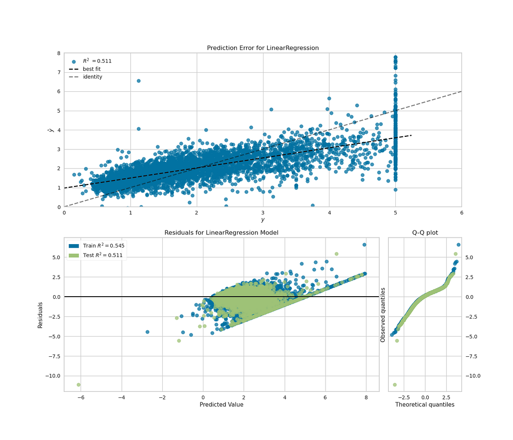
To experiment with how flexible this would be with matplotlib subplots, I took the California Housing toy dataset from scikit-learn, for regression problems, and made a single figure with plots that show both the fit of the model and the distribution of the residuals of the fit. The visualisers can take scikit-learn pipelines as inputs, as well as classifiers, making reuse of scikit-learn code convenient.
While I wasn’t able to get plotting on multiple matplotlib axes objects using the class-based API for visualisers, the “quick draw” functions shown below worked well, producing a plot that showed my regression fit, while also quickly showing that my residuals weren’t ideally distributed for a linear regression model. This implementation is shown in the code block below.
from sklearn.datasets import fetch_california_housing
import pandas as pd

from sklearn.pipeline import make_pipeline
from sklearn.model_selection import train_test_split
from sklearn.preprocessing import StandardScaler
from sklearn.linear_model import LinearRegression
from sklearn.metrics import r2_score
import matplotlib.pyplot as plt

from yellowbrick.regressor.prediction_error import prediction_error
from yellowbrick.regressor import residuals_plot

# Getting example dataset
X, y = fetch_california_housing(return_X_y=True, as_frame=True)
X_train, X_test, y_train, y_test = train_test_split(X, y, test_size=0.2)

feature_cols = [
    "MedInc",
    "HouseAge",
    "AveRooms",
    "AveBedrms",
    "Population",
    "AveOccup",
]

pipeline = make_pipeline(
    StandardScaler(),
    LinearRegression(),
)

pipeline.fit(X_train[feature_cols], y_train)

fig, axs = plt.subplots(2, 1, figsize=(14, 12));

# quick draw method
visualiser_errors = prediction_error(
    pipeline,
    X_train[feature_cols],
    y_train,
    X_test[feature_cols],
    y_test,
    show=False,
    shared_limits=False,
    ax=axs[0],
)

# quick draw method
visualiser_residuals = residuals_plot(
    pipeline,
    X_train[feature_cols],
    y_train,
    X_test[feature_cols],
    y_test,
    hist=False,
    qqplot=True,
    show=False,
    ax=axs[1],
)

visualiser_errors.ax.set_xlim([0, 6])
visualiser_errors.ax.set_ylim([0, 8])
visualiser_errors.ax.legend(loc=2)

fig
The plot above gives the insight I was looking for and only required two function calls to plot (plus some formatting).
My take: this package contains lots of functionality for informative visualisation, while allowing the reuse of scikit-learn pipelines and formatting using object-orientated matplotlib. I’d recommend this to any data scientist looking for a quick and easy way to visualise their models.
This package from the well-known data science researcher, author, and developer of PyTorch Lightning, Sebastian Raschka, introduces itself as “Mlxtend (machine learning extensions) is a Python library of useful tools for the day-to-day data science tasks”. While not exclusively focussed on visualisation, it contains some visualisation options, with matplotlib as the backend.
To give this package a spin, I decided to use the plot_decision_region() function, to compare the decision regions of the logistic regression, SVC, and adaboost classifiers on the penguins dataset. The code below shows the implementation of the plotting of three sub-plots, with an accuracy for each classifier as the title of the subplots.
from sklearn.linear_model import LogisticRegression
from sklearn.svm import SVC
from sklearn.ensemble import HistGradientBoostingClassifier, AdaBoostClassifier
from sklearn.impute import SimpleImputer
from sklearn.preprocessing import OneHotEncoder, LabelEncoder
from sklearn.compose import ColumnTransformer
from sklearn.metrics import accuracy_score
import numpy as np
from mlxtend.plotting import plot_decision_regions

# penguins dataset downloaded locally
penguin_filepath = "../data/penguins_size.csv"
df_penguins = pd.read_csv(penguin_filepath)

penguin_feature_cols = [
    "culmen_length_mm",
    "culmen_depth_mm",
    # 'flipper_length_mm', 'body_mass_g',
]

le = LabelEncoder()

X = df_penguins[penguin_feature_cols]
y = le.fit_transform(df_penguins["species"])
X_train, X_test, y_train, y_test = train_test_split(X, y, test_size=0.2)

simple_inputer = SimpleImputer()
X_train = simple_inputer.fit_transform(X_train)
X_test = simple_inputer.transform(X_test)

lr_model = LogisticRegression().fit(X_train, y_train)
svc_model = SVC().fit(X_train, y_train)
adab_model = AdaBoostClassifier().fit(X_train, y_train)

# plotting
figure, ax = plt.subplots(1, 3, figsize=(16, 6))

clf_names = ["Logistic regression", "SVC", "AdaBoost"]
clfs = [lr_model, svc_model, adab_model]

xlabel, ylabel = penguin_feature_cols
for clf, clf_name, ax in zip(clfs, clf_names, axes):
    plot_decision_regions(X_test, y_test, clf=clf, ax=ax)

    acc = accuracy_score(y_test, clf.predict(X_test))

    ax.set_xlabel(xlabel)
    ax.set_ylabel(ylabel)
    ax.set_title(f"{clf_name}: accuracy: {100.0 * acc:.2f}%")

figure

Relatively easily, we are able to plot the decision regions for each of these classifiers on the axes objects. These plots show how each of these classifiers separate predictions based on features, including exhibiting the overfitting of the adaboost classifier. We did have to convert the data to numpy arrays, as this function doesn’t accept pandas dataframes as input, despite pandas now accepting dataframes as input for transformers. Given how busy Sebastian Raschka has been with his other projects, I don’t think we can be too harsh about this.
My take: This package has plotting functionality that allows the user to get further insights into their models by re-using their scikit-learn models and enabling the use of matplotlib to configure the plots as you wish. The other functionality offered by the package is also definitely worth exploring.
This package describes itself as “matplotlib utilities for the visualization, and visual analysis, of financial data”. The README in the GitHub repo describes the history of the package, which began as code extracted from the depreciated matplotlib.finance package, and had a previous form under the name mpl-finance. The package focuses on the visualisation of financial data (e.g. stock prices) over time and provides several examples of how to do this in its examples directory.
To give this package a try, I downloaded a sample of Apple’s stock price and plotted a candlestick plot for a sample of the stock price back in 2004.
import mplfinance as mpf
import matplotlib.pyplot as plt

df_AAPL = pd.read_csv("../data/AAPL.csv.zip")

df_AAPL.set_index("Date", inplace=True)
df_AAPL.index = pd.to_datetime(df_AAPL.index)
df_AAPL = df_AAPL[(df_AAPL.index > "2004-02-01") & (df_AAPL.index < "2004-05-01")]

mpf.plot(df_AAPL, type="candle", style="binance")
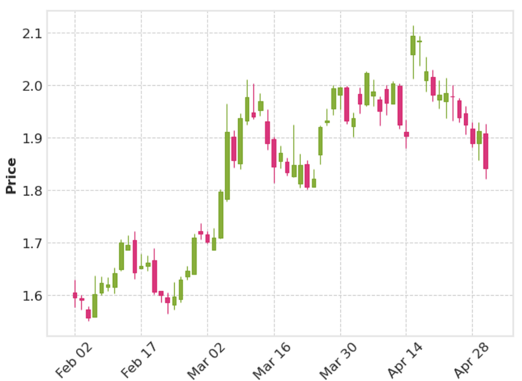
This shows a candlestick plot that looks decent, with one line of plotting. Provided the dataframe passed has the correct headings and the index set as the date, mplfinance can pick up the details it needs to create the plot.
The package also has the option to add more information on the daily stock prices to the plots. Using the same data, I used the addplot option of mpl.plot to display the high and low values for each day in one subplot, above a subplot that showed the volume of stock traded every day and the range every day.
df_AAPL["range"] = df_AAPL["High"] - df_AAPL["Low"]

add_plots = [
    mpf.make_addplot(df_AAPL[["High", "Low"]]),
    mpf.make_addplot(df_AAPL["range"], panel=1, color="g"),
]
mpf.plot(df_AAPL, addplot=add_plots, volume=True)
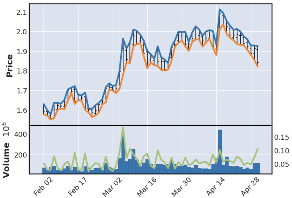
This plot contains a lot of information, created with relatively few lines of code. However, the right-hand side y-axis on the lower plot is missing a label. Quite often, plotting functions like this will return the figure or axes objects automatically. However, in the doc string for the plot() function, there is no description of how to access this, or what the function can return. I dug into the source code and found that some of the kwargs provided to the function do have effects, including returnfig=True returning the figure and axes objects. From this, I was able to access the axis object I needed and add a label, but having to dig to find this functionality was fairly inconvenient.
fig, *axes_objects = mpf.plot(df_AAPL, addplot=add_plots, volume=True, returnfig=True)
axes_objects[0][3].set_ylabel("Range")

fig
My take: This package does enable visualisation of financial data in few lines of code. However, it is let down by the user having to really dig in to find the full functionality, and the slightly strange make_addplot API. That being said, this package has a lot of potential and the number of examples and plotting styles are good. A possible alternative for users would be the implementation of candlestick charts in plotly, which has the strong advantage of being able to zoom in on specific ranges in a long time series.
This package “brings together Matplotlib…and D3js, the popular JavaScript library for creating interactive data visualizations for the web”, setting out to tackle one of matplotlib’s biggest weaknesses - its lack of interactivity. The docs contain some nice examples of how this can be achieved in matplotlib plots, along with exporting the resulting plots as html.
I used the penguins dataset again to give this library a try. One of the common problems when visualising large datasets is having overlapping distributions of several groups, making it difficult to observe and compare individual distributions. After trying to replicate the interactive legend example for histograms for each group, I had no success. After some searching, I concluded the containers that are used for histograms aren’t supported by mpld3, but I’d be delighted to be shown I’m wrong. Fortunately, I was able to get the scatter plot functionality working for the penguins dataset, giving me some information about the distribution of the two features, which would be very useful on a larger dataset.
fig, ax = plt.subplots(figsize=(10, 6))

ax.grid(True, alpha=0.3)

for species in df_penguins["species"].unique():
    (l,) = ax.plot(
        df_penguins[df_penguins["species"] == species]["culmen_depth_mm"].values,
        df_penguins[df_penguins["species"] == species]["culmen_length_mm"].values,
        label=species,
        marker=".",
        markersize=20,
        linestyle="None",
    )

handles, labels = ax.get_legend_handles_labels()  # return lines and labels
interactive_legend = plugins.InteractiveLegendPlugin(
    ax.lines, labels, alpha_unsel=0.1, alpha_over=1.5, start_visible=True
)

plugins.connect(fig, interactive_legend)

ax.set_xlabel("Culmen depth [mm]")
ax.set_ylabel("Culmen length [mm]")
ax.set_title("Culmen length vs depth", size=20)

mpld3.display(fig)

The above picture obviously doesn’t display the functionality, but by clicking on the legend in the notebook the individual groups will disappear, and this can also be exported to a html file. Also, before the plugins from mpld3 get used, no changes to the code are needed, meaning existing matplotlib code can be easily extended to give this functionality.
My take: This package makes a solid attempt towards adding interactivity to matplotlib, and has an appealing syntax in that existing matplotlib scripts can have a few lines of code appended to give interactivity. However, it doesn’t work for all types of matplotlib plots, and judging by the FAQ, adding interactivity simply won’t be possible for some types of plots, meaning following a plotly example might be your best bet if you’re starting from scratch and want interactivity.
While displaying data in tabular format might not be the first thing people think of when they hear data visualisation, a well-structure table of aggregated data in a table can be an effective way of displaying information for a report or presentation, and being able to generate these tables automatically makes life much easier. This package introduces itself as “a Python package for creating great-looking display tables”, and makes the distinction that this is aimed to offer features to create tables “you’d find in a web page, a journal article, or magazine”.
To give this package a go and see how pretty a table I could create, I downloaded a table of New York property prices from Kaggle and set about displaying some aggregate properties for each area, included in the code snippet below.
from great_tables import GT
from great_tables import html, md

import calendar

df_NY = pd.read_csv(NY_housing_path)

NO_BEDS_COL = "No. beds"
NO_BATHS_COL = "No. baths"
FLOOR_AREA_COL = "Floor area [sqft]"
NO_LISTINGS_COL = "No. listings"
PRICE_COL = "Price"
LOCALITY_COL = "NY Locality"

rename_dict = {
    "LOCALITY": LOCALITY_COL,
    "BEDS": NO_BEDS_COL,
    "BATH": NO_BATHS_COL,
    "PROPERTYSQFT": FLOOR_AREA_COL,
    "ADDRESS": NO_LISTINGS_COL,
    "PRICE": PRICE_COL,
}

GT( # pandas dataframe serves as inupt to GT onject
    pd.concat( # aggregating data using pandas
        [
            df_NY.groupby(by=["LOCALITY"])[
                ["BEDS", "BATH", "PROPERTYSQFT", "PRICE"]
            ].median(),
            df_NY.groupby(by=["LOCALITY"])[["ADDRESS"]].count(),
        ],
        axis=1,
    )
    .reset_index()
    .rename(columns=rename_dict)
).fmt_integer( # table display from chained methods
    columns=[NO_BEDS_COL, NO_BATHS_COL, FLOOR_AREA_COL, NO_LISTINGS_COL]
).fmt_currency(
    columns=PRICE_COL
).tab_spanner(
    label=md("*Median property properties*"),
    columns=[NO_BEDS_COL, NO_BATHS_COL, FLOOR_AREA_COL, PRICE_COL],
).tab_source_note(
    source_note=f"Source: {source_address}"
).tab_header(
    title=html("<strong>Properties across New York</strong>"),
    subtitle=html("Average property properties by New York localities"),
)
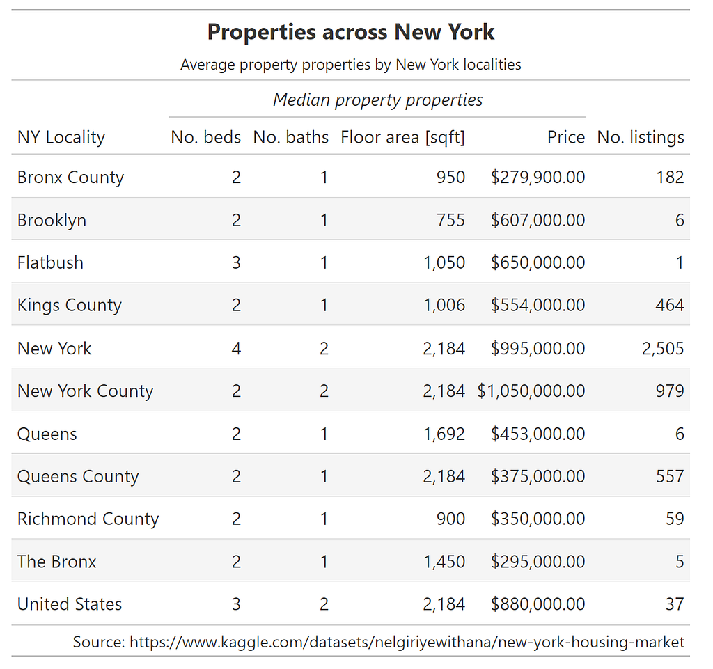
As the code snippet shows, the ability to chain methods together allows fine control of the components of the table, including formatting and naming the source.
A similar exercise below on sales from a Walmart dataset allowed the sales across different stores to be summarised easily.
df_sales = pd.read_csv(WALMART_SALES_FILE)
df_sales["Date"] = pd.to_datetime(df_sales["Date"], format="%d-%m-%Y")
# Only selecting some stores as a sample
df_sales = df_sales.loc[df_sales["Store"] < 6, :]
df_sales.loc[:, "Month"] = df_sales["Date"].dt.month
# calculating percentage of sales per month
groupby = df_sales.groupby(by=["Month", "Store"])["Weekly_Sales"].mean().unstack()
groupby_percentage_sales_per_month = groupby / groupby.sum(axis=0)
groupby_percentage_sales_per_month.reset_index(inplace=True)
groupby_percentage_sales_per_month["Month"] = groupby_percentage_sales_per_month[
"Month"
].apply(lambda x: calendar.month_abbr[x])
groupby_percentage_sales_per_month.columns = (
groupby_percentage_sales_per_month.columns.astype("str")
)
GT(
groupby_percentage_sales_per_month,
rowname_col="Month",
).data_color(
# domain=[0.8, 0.10],
palette=["rebeccapurple", "white", "orange"],
na_color="white",
).tab_header(
title="Average percentage yearly sales by month for five Walmart stores",
# subtitle=html("Average monthly values at latitude of 20°N."),
).tab_source_note(
source_note=f"Source: https://www.kaggle.com/datasets/mikhail1681/walmart-sales"
).fmt_percent(
[
"1",
"2",
"3",
"4",
"5",
],
decimals=2,
)

Again, with a few chained methods, we have a table that allows us to clearly see some trends across these five different shops. You can quickly see how (unsurprisingly) sales peak in December, with lower fractions of sales in January and July.
My take: This is a well-developed package that makes creating tables for presentation straightforward. Taking pandas dataframes as inputs to the GT class, along with the option of chaining of formatting methods, makes this a straightforward package to adapt. As a researcher, if this could export to LaTeX format, that would be amazing. Thankfully someone has already submitted an issue asking for this as a feature, with an estimation of “done in early-to-mid 2024”, so this feature is eagerly awaited
Hopefully you found this article somewhat interesting and useful. I believe the breadth of the packages here strongly underline the strengths of the scientific python stack. The notebook the plots and tables in this article were created in can be found on my GitHub here. Please share any constructive criticism, including anything key in the packages I missed, and any other visualisation packages that expand upon pandas/scikit-learn/matplotlib well!
<hr><p>Visualisation libraries in python for expanding your data storytelling was originally published in The Startup on Medium, where people are continuing the conversation by highlighting and responding to this story.</p>