
Keywords: COVID-19, London, city, data science, pandas, geopandas, scikit-learn, geospatial, maps, race, matplotlib, modeling, boroughs, numpy, selenium, python, machine learning, data visualization
Author’s note: this was a short project done several years ago and contains some non-rigorous modelling and visualisation missing key components. So while it remains an interesting data exploration project, I would discourage anyone from drawing definite conclusions using these methods.
From the end of 2019, the SARS-CoV-2 pandemic has flooded our newsfeeds and headlines with a vast array of numbers; we measure the local growth using the R number, compare the effectiveness of lockdown measures in different countries using cases per population number, and we see the deaths that the official COVID fatalities miss through the excess deaths. Another measure of the seriousness of the disease, and one which can highlight where adequate medical care is not being brought, is the ratio of the deaths due to COVID and the cases diagnosed in an area. This is the quantity I will be exploring in this project.
We know that there are many health factors that affect the COVID-19 mortality rate, including weight, age, smoking and underlying conditions like diabetes and asthma. One of the more shocking statistics to emerge, however, has been the strong positive correlation between COVID prevalence and non-white persons. An analysis from the CDC published in August showed that, compared to white individuals, hispanic or Latino persons are 2.8 times as likely to catch the virus, American Indian or Alaska native persons are 5.3 times as likely to be hospitalised, and Black or African American persons have a fatality rate 2.1 times as high. These statistics are stark indicators, that despite what recent advertisements like to say, for many people, we’re most certainly not in this together.
To examine this discrepancy in COVID-19 prevalence across different groups and attempt to somewhat visualise it, I decided to look at the cases and deaths of the disease across the boroughs of London. I knew the Office for National Statistics (ONS) would have more detailed versions of the information I was looking for to investigate the trends, and as a large, international city with many different groups in it, London would provide me with the range of data I was looking for to gain some understanding of what affects a person’s chances of surviving catching the coronavirus.
I pulled together a range of data sources to use in this project, which I will briefly describe below.
To visualise the London boroughs, I used a GeoJSON file from the website of Stuart Grange, a postdoctoral researcher at Empa, Switzerland. This file can be found here.
The ONS regularly publishes information on the deaths attributed to the coronavirus online, which can be found here. It also breaks down information on the positive case tests in to regions, which can be found here.
The demographics of London have its own Wikipedia page, and it was from this that I was able to scrape the racial makeup of each borough (originally from the 2011 UK census).
While censuses in the UK take place every 10 years, the ONS continues to estimate the population changes in each of its administrative areas in between these. This includes ages, sex, population densities and immigrations.
Firstly, I imported the GeoJSON file, and simply plotting the dataframe shows the geographic data.

The geoJSON data seems to match what we expect, so we’ll move forward with importing the COVID deaths for each borough.
The ONS reports a lot of information that’s heavily annotated, so a bit of cleaning was involved. This included removing the first few rows of the datasheet, dropping columns we weren’t interested in and renaming others, shortening the names of regions, and removing the non-COVID death columns.
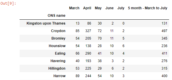
A similar method for cleaning the COVID cases data is shown below. However, as the cases are given in week numbers, they must be converted to dates. For this a function was made, which was then implemented by making a dictionary in a list comprehension.

The summed cases until the month of July have now been added to the dataframe, and appear as how we would expect.
The race data can now be extracted from the Wikipedia page. This was done using the selenium and BeautifulSoup libraries.
The table of race demographics is contained in a table of class ‘wikitable sortable’. In this table, the values are held in <td> tags, and the race headings and boroughs are held in <th> tags. Functions were defined to extract the values and boroughs from each of these tags. These were saved to arrays using list comprehensions, the data was reshaped and then formed into a dataframe.
The dataframe we’ve extracted matches what we would expect.

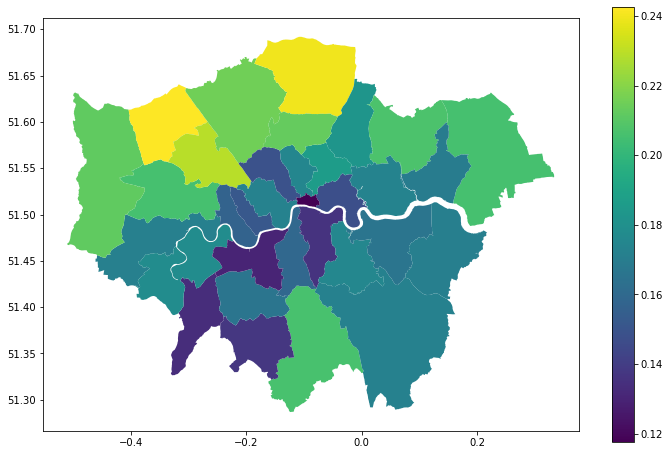
All these data sources are easily joined together using pandas concat function, with the borough name set as the index. The ratio of deaths to cases can be added to the dataframe easily using pandas. Taking a look at this across London shows a significant spread.
The median ages for each borough are extracted from the population estimates done by the ONS. Using the areas provided in the geoJSON file, population densities for each borough can be found.
To model the data, scikit-learn’s ridge regression model was used, to reduce the chances of overfitting, which seems likely given the co-linearity of some of the variables I have chosen. A function to make a model and plot it against the known data was used.
When a model is intended to make future predictions, and thus must have its accuracy measured, the data is split into training and testing sets. In this case, I am only interested in the trends of the data and thus shall simply be using the entire dataset (consisting of 33 boroughs, not exactly very large).
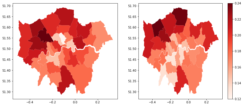
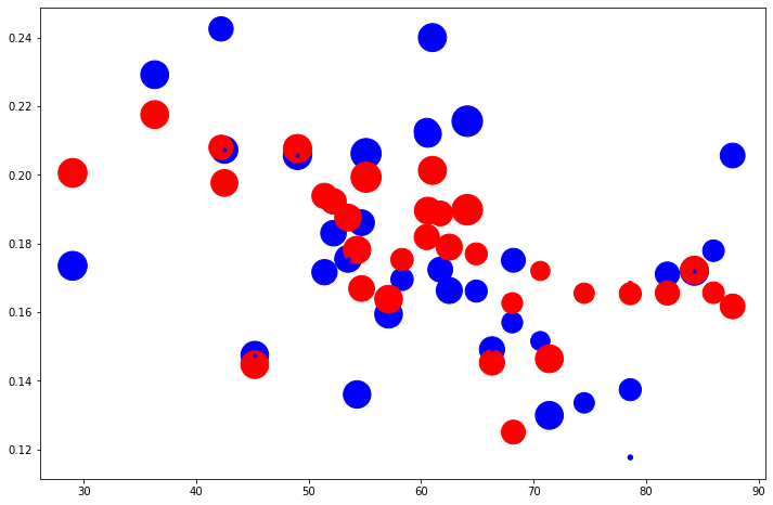
Modelling using all the features we have incorporated into our dataframe provides us with coefficients for each of our variables, as well as a visual comparison against the known death:case ratio.
Features : ['White', 'Black', 'Asian', 'Other', 'Median Age', 'Population Density']
Coefficients: [[-0.00021014  0.00180947  0.00084168  0.00486416  0.00339385 -0.00033938]]
RMSE: 0.024022110590386066
Coefficient of determination (r^2): 0.4202066115941455
There’s a few insights we can quickly gleam from these results. In terms of the model fit, a value of R^2=0.42 shows that, while the model is far from a perfect fit, it’s at least doing significantly better that a purely random model, and there is some correlation in the feature and target varibles. The coefficients are definitely interesting. While there is a negative correlation between the COVID death:cases ratio and the proportion of white people in a borough, the model suggests that the expected fatality of the virus increases with the proportion of every other race in that borough.
In fact, if we take the magnitudes of the coefficients as indications of the dependence of these variables on the fatality of the disease, race seems to have roughly the same effect as the medium age. In fact, population density, with a coefficient an order of magnitude, places a surprisingly small role. The model is shown against the original data below, both as a map and as a scatter plot.
In conclusion, this model seems to strongly suggest that in the boroughs of London, race played a significant role in the chances of COVID-fatality at the end of July. Having a socioeconomic statistic like this be on par with a physical health measure is a serious aspect of the diseases progression, which is due a full explanation.
The range of COVID-related fatalities across London shows that the help available is not evenly and fairly distributed. The relation of race to COVID-fatality could be due to biological reasons, or as has been seen with previous natural disasters and health crises, its relationship with poorer economic status, more cramped households, and poorer access to facilities. A Nature paper examining factors associated with COVID-19-related death concluded that “South Asian and Black people had a substantially higher risk of COVID-19-related death than white people, and this was only partly attributable to comorbidities, deprivation or other factors”, strongly implying this socioeconomic factors are playing a significant role.
Obviously this project is meant to be far from the end-all and be-all of examining the factors affecting COVID-19 fatality in London, and there are several prominent limitations. Firstly, it has been well documented that in the first half of 2020, the testing facilities of the UK were completely overwhelmed, so we know that number of cases documented was very far from the true value. In addition, the racial demographics were taken from the 2011 census and may have shifted in the past few years. Simply taking the median age of a population may not give a true representation of the ages of the population; a care home in a relatively youthful borough would not be represented by this statistic.
In terms of producing a model that could make better predictions, further work is planned in to adding new features and performing some feature selection. Another interesting insight into the progression of the pandemic would involve using more recent data to see if this correlation with race has continued as measures to mitigate the virus and the use of new drugs like dexamethasone have begun to be used.
That’s the end of my project. I hope you see how a small amount of web scraping, data manipulation and machine learning can give us a bit of an insight into the forces that are changing our modern world. Thank you for your time and any feedback is appreciated!
Feel free to connect with me on LinkedIn, and the code used in this project can be found at https://github.com/conorhamill36/London_COVID.
This project was written on a jupyter notebook hosted on an AWS EC2 instance. This can be set up using the instructions found in this guide by Chris Albon. The use of geoJSON data with GeoPandas was inspired by this article from Graciela Carrillo, modelling Airbnb prices in Edinburgh.
<hr><p>All in This Together? Trends in COVID-19 Fatality Across London Boroughs From Machine Learning was originally published in The Startup on Medium, where people are continuing the conversation by highlighting and responding to this story.</p>